


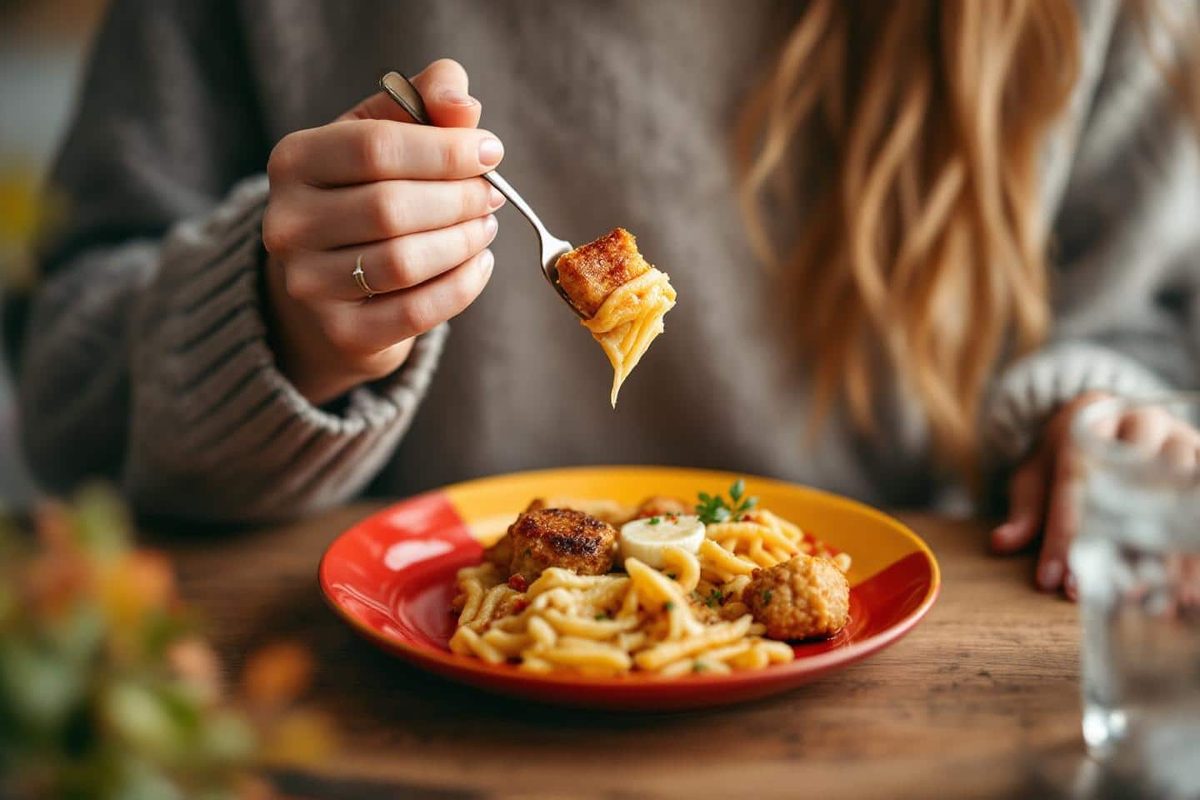
It feels like a trick. It feels too simple. But as the days shrink and the cold sets in, the urge to pile high plates of comfort food becomes almost physical. We reach for resolutions. We fight willpower. We fail. Meanwhile, the solution might just be sitting in your kitchen cabinet.
Changing the color of your dishes isn’t about magic. It’s about biology. It’s about how your brain interprets volume before your stomach even registers fullness.
Why visual contrast dictates portion perception
We tend to think hunger is a stomach sensation. It’s not. It’s a brain game. Your eyes lead the way. What you see tells your mind how much you are about to eat.
This is where the color of your plate matters most.
A white plate against white rice or pale pasta disappears. The food blends in. The brain sees less. You serve more. You eat more. You might not even realize you’ve added a second helping until you’re looking at an empty bowl.
Darker plates change the math. They create contrast. They make portions look larger than they are. This visual exaggeration tricks the satiety centers in the brain. You feel full faster. Not because you ate more, but because your brain thought you ate more.
It’s a subtle shift. One moment you are serving yourself. The next, you stop. The urge to go back to the kitchen vanishes.
The psychology of red, blue, and green
Not all colors work the same way. Your brain reacts to specific wavelengths differently. This isn’t just theory. It’s observed behavior in dining settings.
-
Red: This color is energetic. It grabs attention. But it also speeds things up. People eat faster when red is involved. Faster eating often means ignoring early signals of fullness. It’s stimulating, yes. But it can lead to overconsumption if you aren’t careful.
-
Blue: Blue is rare in natural foods. Our ancestors didn’t find blue berries or blue meat. Because of this, blue can actually suppress appetite. It slows you down. It makes you pause. A blue plate forces a moment of clarity. You notice the contrast. You notice the portion. You might just eat less.
-
Green: Green signals health. It signals vitality. It creates a calming atmosphere. When you eat from green, you tend to take your time. You savor. You don’t shovel. This is useful during the heavy winter months when we tend to eat quickly and mindlessly.
The key isn’t picking a “magic” color. The key is contrast.
Matching your food to your goals
You don’t need to replace your entire dinnerware set. You just need to understand the interplay between the food and the dish.
If you are serving something light—potatoes, chicken, white fish—put it on a dark plate. The contrast makes the portion look substantial. Your brain accepts it as enough.
If you are serving something dark or colorful—stew, chocolate cake, roasted vegetables—use a lighter plate. The dark food stands out. It looks impressive. But be careful. On a white plate, a dark stew looks smaller than it is. You might think, “I’ll just add a little more.” Before you know it, you’ve doubled your portion.
This isn’t about restriction. It’s about awareness.
Breaking the automatic cycle
We eat by habit. We serve ourselves. We fill the plate. We clean it. We ask for more. This cycle runs on autopilot. We don’t think about it.
Autumn brings heavier meals. We seek warmth. We seek comfort. The autopilot gets stronger.
A simple change in plate color disrupts this loop. It forces the brain to pay attention. It breaks the automatic “fill the void” reflex.
You aren’t depriving yourself. You are just giving your eyes a better reference point.
There is no calorie counting here. No weighing food. No stress. Just a shift in perspective.
Does it work for everyone? Probably not. Habits are deep. But for many, it’s a low-effort tool that yields high results.
The cold is coming. The holidays are near. The temptation to eat more will grow.
Will you fight it with willpower? Or will you change the color of your plate?
Your brain is watching. It’s always watching.
We rely on vision far more than we admit. Recent behavioral studies confirm that humans use visual cues to estimate portion sizes, often without realizing it. The old saying “appetite comes with eating” might be better phrased as “appetite comes with looking.” Your brain is constantly calculating volume based on what it sees, not just what it tastes.
How plate color affects satiety signals
The science behind plate color contrast and portion control is straightforward. When food stands out against the background, your brain processes the quantity more accurately. If your pasta matches your beige plate, your brain has to work harder to gauge how much is left. High contrast—like orange carrots on a blue plate—makes the portion distinct.
This visual clarity triggers a natural reduction in consumption. You are less likely to overeat when you can clearly see the boundary between the food and the empty space. It is not about restriction. It is about perception. By increasing the visual difference between the dish and the dishware, you allow your satiety signals to kick in earlier, before you have physically overfilled your stomach.
Choosing dishware that supports mindful eating
You do not need to replace your entire kitchen to see results. The goal is subtle disruption of the visual norm. Most home kitchens feature white or neutral-toned crockery. Food blends in. Switching to a single, distinct color breaks this pattern.
When selecting items, look for these specific characteristics:
- Solid, bold colors : Avoid pastels or whites. Deep blues, blacks, or terracotta create strong boundaries.
- Simple patterns : Busy motifs clutter the visual field. They make it harder for the eye to distinguish the edge of the food.
- Quality over price : You do not need designer ceramics. Affordable glass or stoneware works just as well. The material matters less than the color contrast.
Testing this at home is inexpensive. Buy one set of plates in a color you rarely use. Serve autumn staples like soups, gratins, or fruit salads on them. The “contrast effect” becomes immediate. You will likely notice you stop eating when the plate looks full, rather than when you feel stuffed.
Visual tricks beyond the plate
Color is only one lever in the psychology of eating. The way you present food and your environment also dictates intake.
Presentation matters. Small portions arranged neatly look more abundant than a messy heap of the same amount. Using smaller plates creates an illusion of generosity; the food fills more of the surface area, tricking the brain into perceiving adequacy.
Lighting plays a role. Harsh, bright light encourages speed. Softer, warmer tones slow you down. Eating slowly gives your body time to register fullness.
Remove distractions. Eating in front of a screen divides attention. When you are distracted, you miss the visual cues of satiety. Sit at a table. Focus on the meal. This simple act of mindfulness aligns your brain with your body’s needs.
Avoiding the false sense of security
These tricks are aids, not cures. Do not assume that using a contrasting plate grants you permission to ignore hunger cues. The visual strategy works best when combined with genuine attention to what you are consuming.
Keep portions aligned with your actual energy needs. If you consistently overeat on blue plates, the color is not fixing a metabolic issue. It is simply helping you see the problem more clearly. Variety helps too. Rotating plate colors prevents habituation. If you always eat from the same bowl, your brain ignores the visual boundary. Change it up to keep your awareness sharp.
The objective is to listen to your body, not override it. In the rush of daily life, especially during holiday seasons marked by abundance, these small adjustments offer a buffer against mindless consumption. It is not about perfection. It is about noticing.
You are rewiring your relationship with food through sight. It is a subtle shift. But over time, the difference between eating because you are hungry and eating because it looks like you should eat fades. The plate is just a mirror. What matters is what you see when you look.


